Design tokens
Design tokens express design decisions using a palette of options from the U.S. Web Design System.
What are design tokens?
Design tokens express a design decision by applying the many color, typography, and spacing options available as design tokens from the U.S. Web Design System (USWDS) to specific contexts within the platforms at the VA. Design tokens allow us to propagate those design decisions to our platforms.
Taxonomy and typology
Our tokens have a taxonomy and typology in order to give us the categorization and levels we need to define our tokens. No token uses all of the taxonomy but it does define the available options.
This organizational structure is informed by the work of Nathan Curtis. Read more about Naming Tokens in Design Systems.
Namespace
System
Defines the system that token originates within. Current values can be:
- uswds: The USWDS. For primitive tokens.
- vads: All token types. This design system.
- vacds: The VA Clinician Design System.
Domain
Currently unused. In the future, could be used for large areas of related tokens that run across systems (e.g. health, benefits, etc.)
Object
These levels refer to a component, element within a component, or component group.
- Group: Defines a family of tokens. Examples include forms and navigation.
- Component: Component name
- Element: Elements within a component
Base
Category
High level grouping. Current values are:
- Color
- Elevation
- Font
- Shape
- Size
- Spacing
Future additions from USWDS may include flex, order, and opacity.
Concept
Allows tokens to be grouped within a category. Current values may include action, hub, inset, vertical, etc. Future additions may include visualization.
Property
Defines the token scope. This can be synonymous with the CSS property name.
Modifiers
Variant
Defines variations to distinguish use cases. Examples include primary, secondary, tertiary and heading, body, default.
State
Defines states of interactivity. Examples include hover, press, focus, error, etc.
Scale
Places the token within an intentional, ordered range of values. Examples include heading levels: 1, 2, 3, 4, 5 and t-shirt sizes: small, medium, large.
Mode
Defines a background setting on which elements appear thus enabling light and dark modes. Examples are on-light and on-dark.
Types
There are three types of design tokens in the VA Design System:
1. Primitive
Primitives mainly come from the USWDS. They are the building blocks that we use. The VA Design System does not use nor add any colors, fonts, nor spacing units that are not defined in the U.S. Design System.
The mobile app library shares primitive tokens with VADS. For example, vads-color-base is a primitive token that references the USWDS token for #1B1B1B.

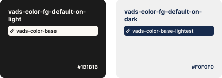
2. Semantic
Semantic tokens communicate how a primitive is used. These tokens capture a semantic meaning that should relay the context in which that token should be used.
In the mobile app library, semantic tokens reference primitive tokens and are sometimes shared with VADS. Since the mobile app library needs to account for theming, we currently maintain our own semantic tokens for light and dark mode. For example, vads-color-fg-default-on-light and vads-color-fg-default-on-dark are the default colors used for foreground elements such as text and icons. They reference VADS’ primitive tokens – vads-color-base and vads-color-base-lightest.
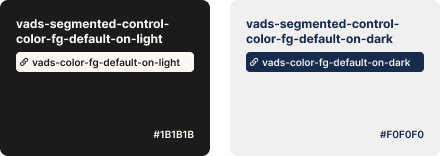
3. Component
Component tokens are scoped to a specific component and represent decisions specific to that component.
In the mobile app library, component tokens reference primitive or semantic tokens and are sometimes shared with VADS. Since the mobile app library needs to account for theming, we currently maintain our own component tokens for light and dark mode. For example, vads-segmented-control-color-fg-default-on-light and vads-segmented-control-color-fg-default-on-dark reference the default colors used for foreground elements such as text and icons.